 1 / 11
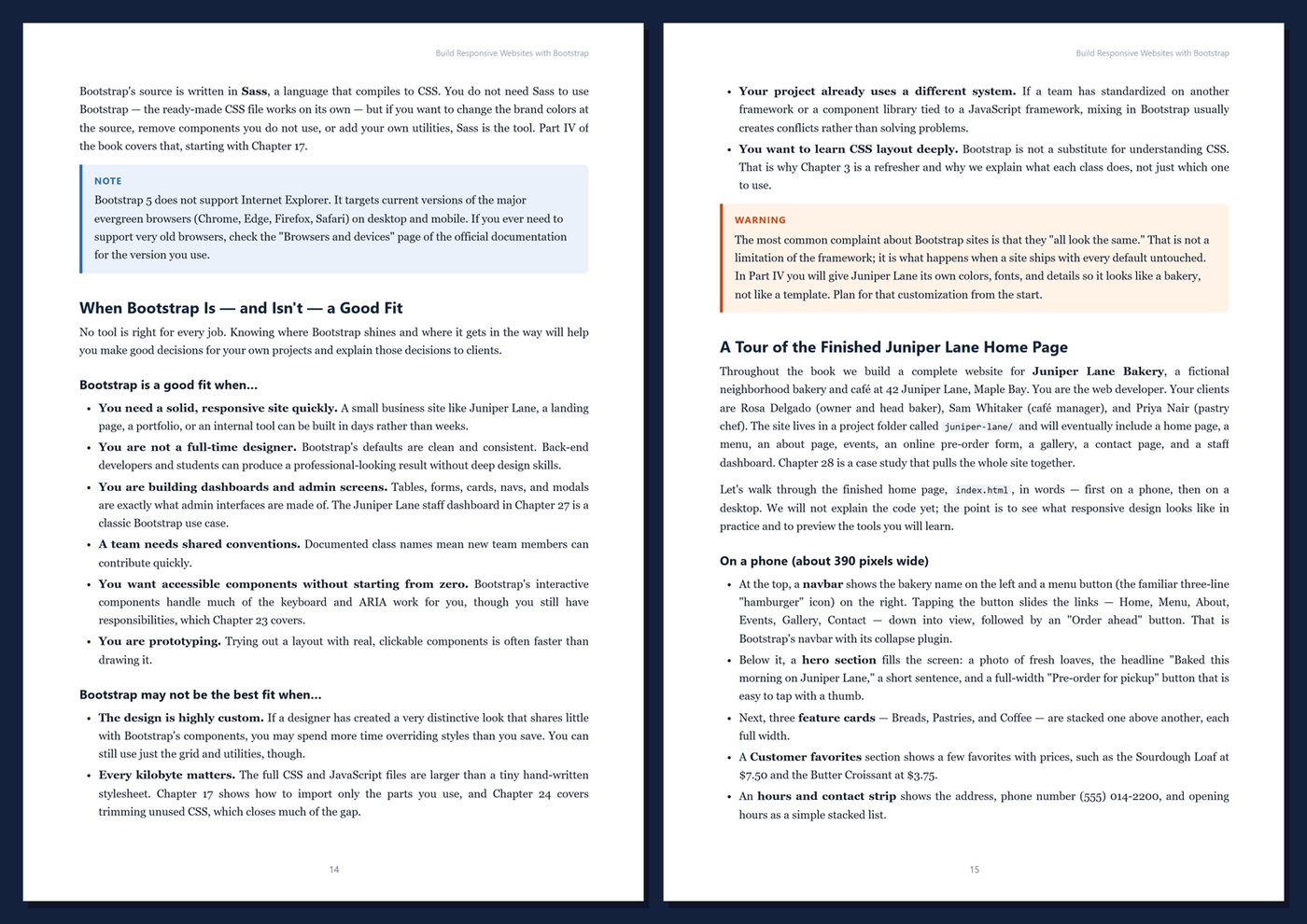
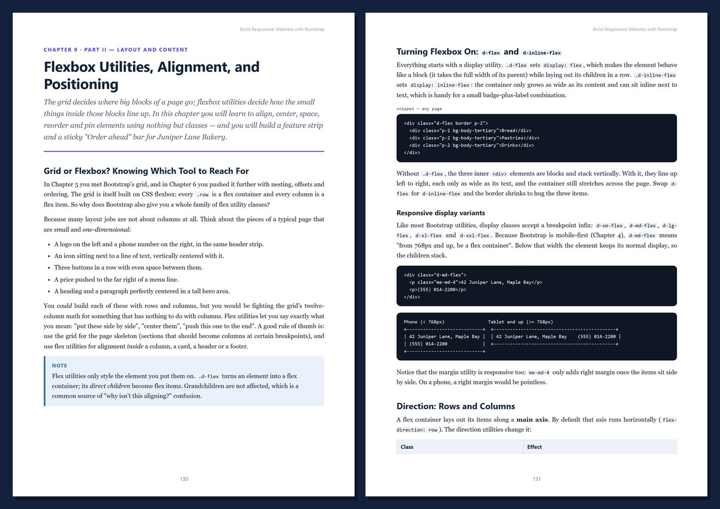
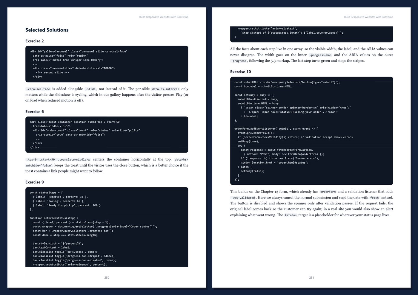
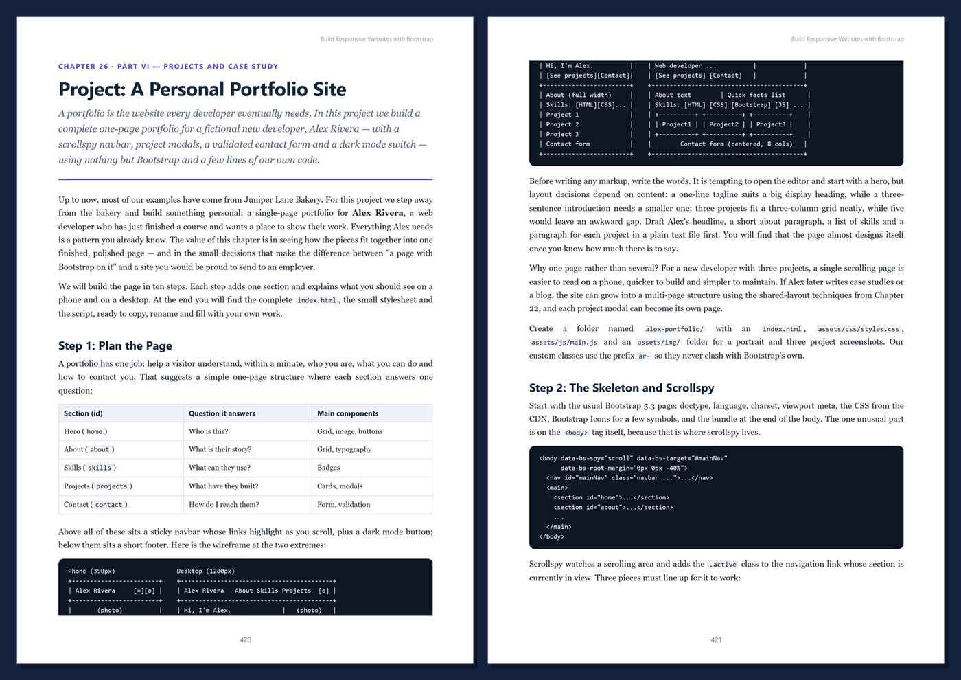
A 495-page, hands-on guide to building responsive, accessible websites with Bootstrap 5 — grid, utilities, components, Sass theming, and three complete projects, with exercises and solutions in every chapter.
From Mobile-First Layouts to Complete, Accessible Sites with Bootstrap 5
Read before you buy: the PDF here is a free sample — the first 20 pages of the 495-page book (payments, sales and reviews on this demo site are sample data). Get the full e-book at thenexbooks on Gumroad.
Build websites that look great on every screen.
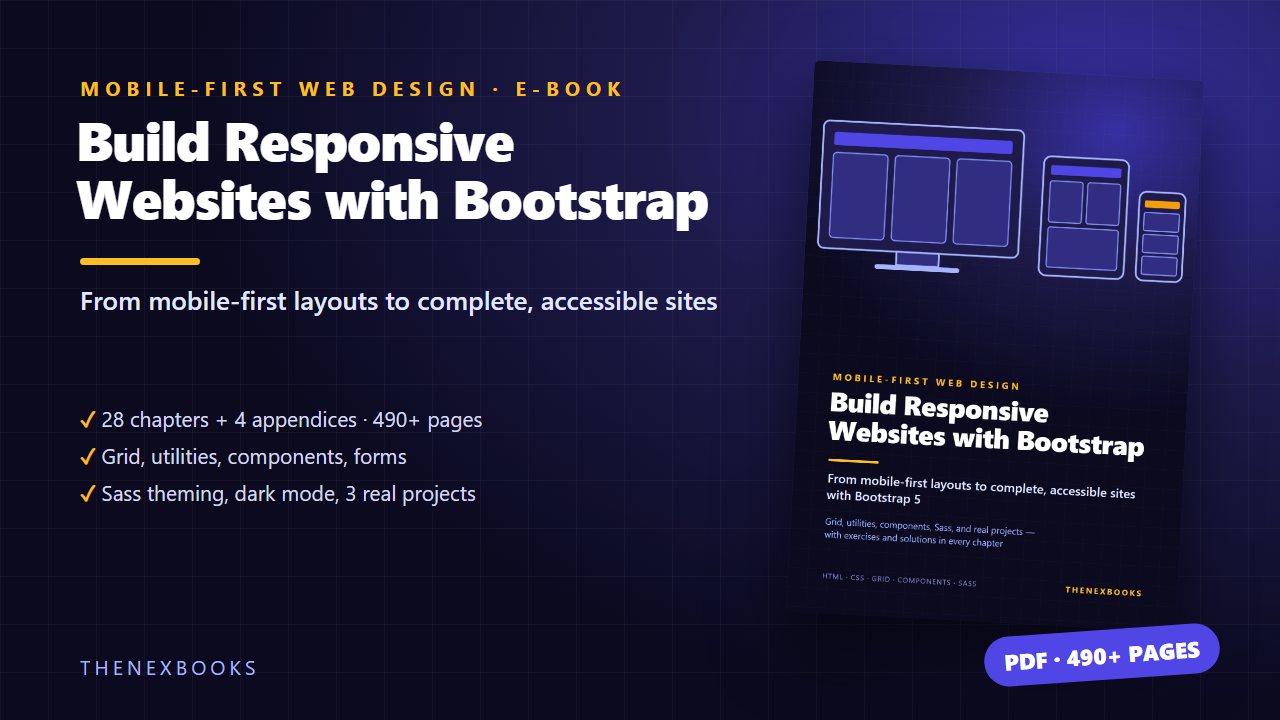
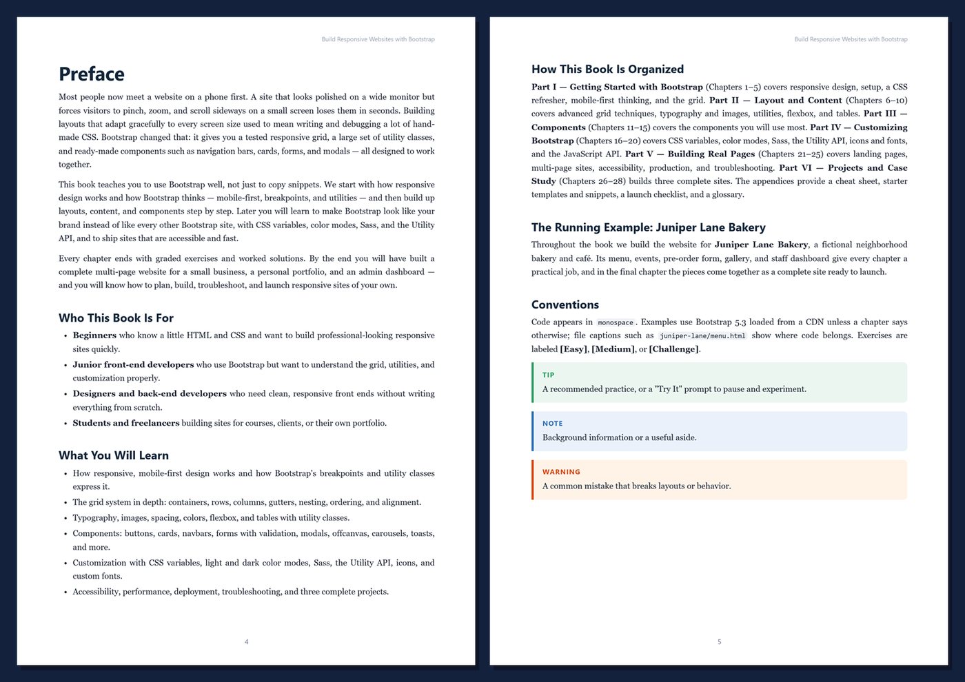
Most visitors meet a website on a phone first. A site that only works on a wide monitor loses them in seconds. Bootstrap gives you a tested responsive grid, hundreds of utility classes, and ready-made components that work together — but copying snippets only gets you so far. This book teaches you how Bootstrap really works, from mobile-first thinking and the grid to making it look like your own brand, so you can plan, build, troubleshoot, and launch responsive sites with confidence. Every chapter ends with graded exercises and worked solutions.
- 495 pages · 28 chapters + 4 appendices
- Responsive design and mobile-first thinking, explained clearly
- The grid in depth: containers, rows, columns, gutters, nesting, ordering, and alignment
- Utilities for spacing, color, typography, flexbox, and tables
- Components: cards, navbars, forms with validation, modals, offcanvas, carousels, and toasts
- Customization with CSS variables, dark mode, Sass, the Utility API, icons, and fonts
- Accessibility, performance, deployment, and a troubleshooting guide for layout problems
- Three complete projects: a portfolio, an admin dashboard, and a full bakery website
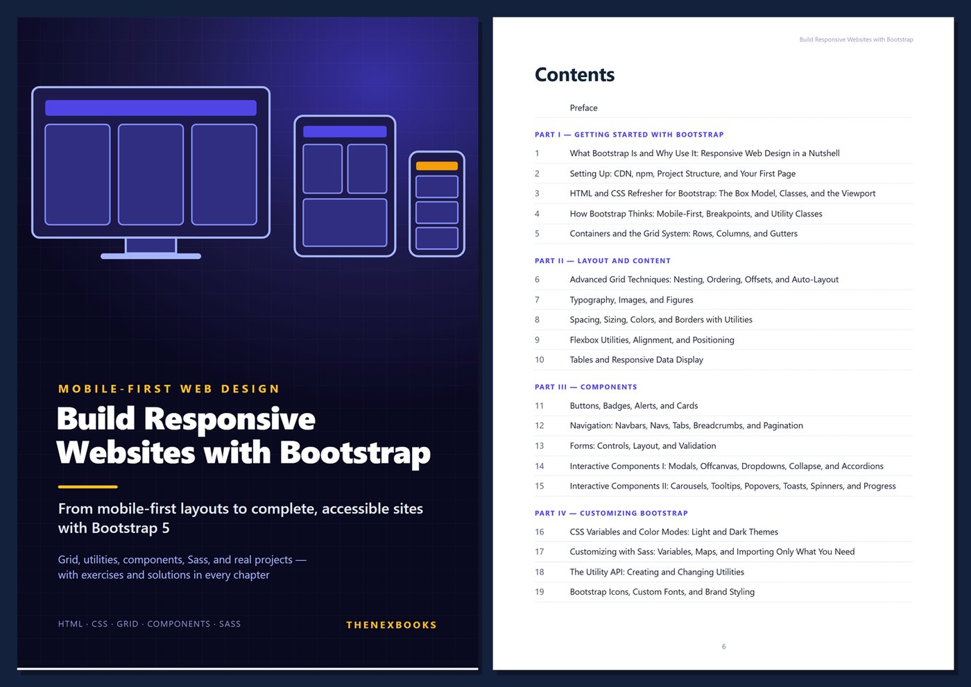
Table Of Contents
Part I — Getting Started with Bootstrap
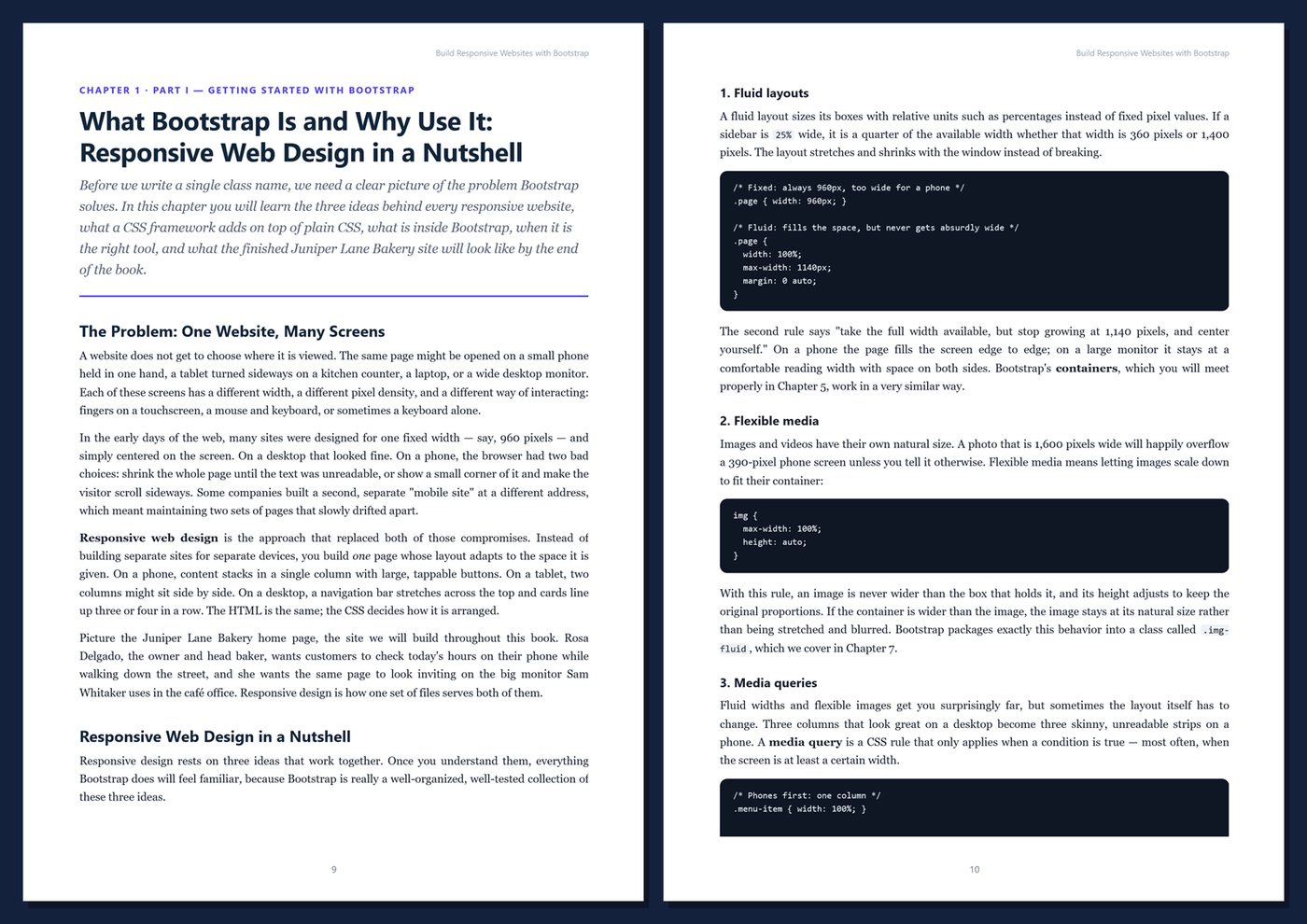
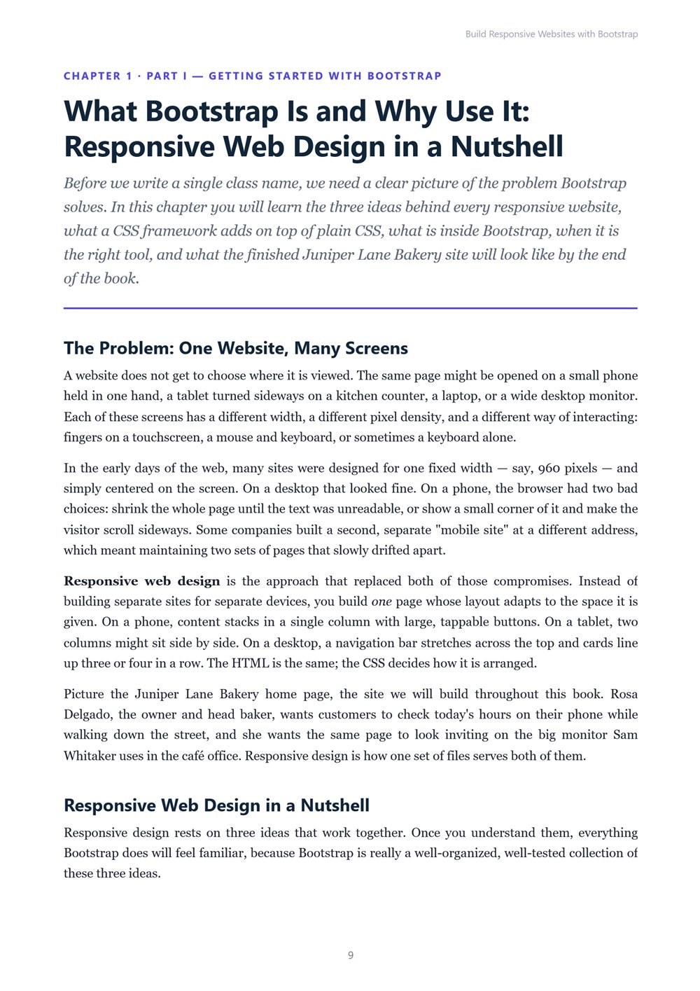
- Ch 1 · What Bootstrap Is and Why Use It: Responsive Web Design in a Nutshell
- Ch 2 · Setting Up: CDN, npm, Project Structure, and Your First Page
- Ch 3 · HTML and CSS Refresher for Bootstrap: The Box Model, Classes, and the Viewport
- Ch 4 · How Bootstrap Thinks: Mobile-First, Breakpoints, and Utility Classes
- Ch 5 · Containers and the Grid System: Rows, Columns, and Gutters
Part II — Layout and Content
- Ch 6 · Advanced Grid Techniques: Nesting, Ordering, Offsets, and Auto-Layout
- Ch 7 · Typography, Images, and Figures
- Ch 8 · Spacing, Sizing, Colors, and Borders with Utilities
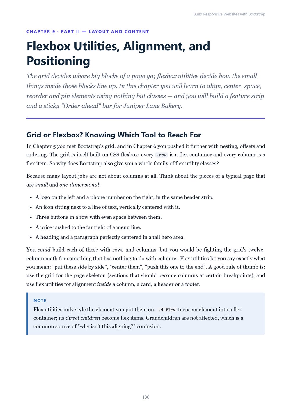
- Ch 9 · Flexbox Utilities, Alignment, and Positioning
- Ch 10 · Tables and Responsive Data Display
Part III — Components
- Ch 11 · Buttons, Badges, Alerts, and Cards
- Ch 12 · Navigation: Navbars, Navs, Tabs, Breadcrumbs, and Pagination
- Ch 13 · Forms: Controls, Layout, and Validation
- Ch 14 · Interactive Components I: Modals, Offcanvas, Dropdowns, Collapse, and Accordions
- Ch 15 · Interactive Components II: Carousels, Tooltips, Popovers, Toasts, Spinners, and Progress
Part IV — Customizing Bootstrap
- Ch 16 · CSS Variables and Color Modes: Light and Dark Themes
- Ch 17 · Customizing with Sass: Variables, Maps, and Importing Only What You Need
- Ch 18 · The Utility API: Creating and Changing Utilities
- Ch 19 · Bootstrap Icons, Custom Fonts, and Brand Styling
- Ch 20 · JavaScript Behaviors: Data Attributes, the JavaScript API, and Events
Part V — Building Real Pages
- Ch 21 · Designing a Landing Page: Hero, Features, Pricing, and Calls to Action
- Ch 22 · Multi-Page Sites: Shared Layout, Navigation, and Footer Patterns
- Ch 23 · Accessibility in Bootstrap Sites
- Ch 24 · Performance and Production: Optimizing, Trimming CSS, and Deploying
- Ch 25 · Common Layout Patterns and Troubleshooting Responsive Problems
Part VI — Projects and Case Study
- Ch 26 · Project: A Personal Portfolio Site
- Ch 27 · Project: An Admin Dashboard
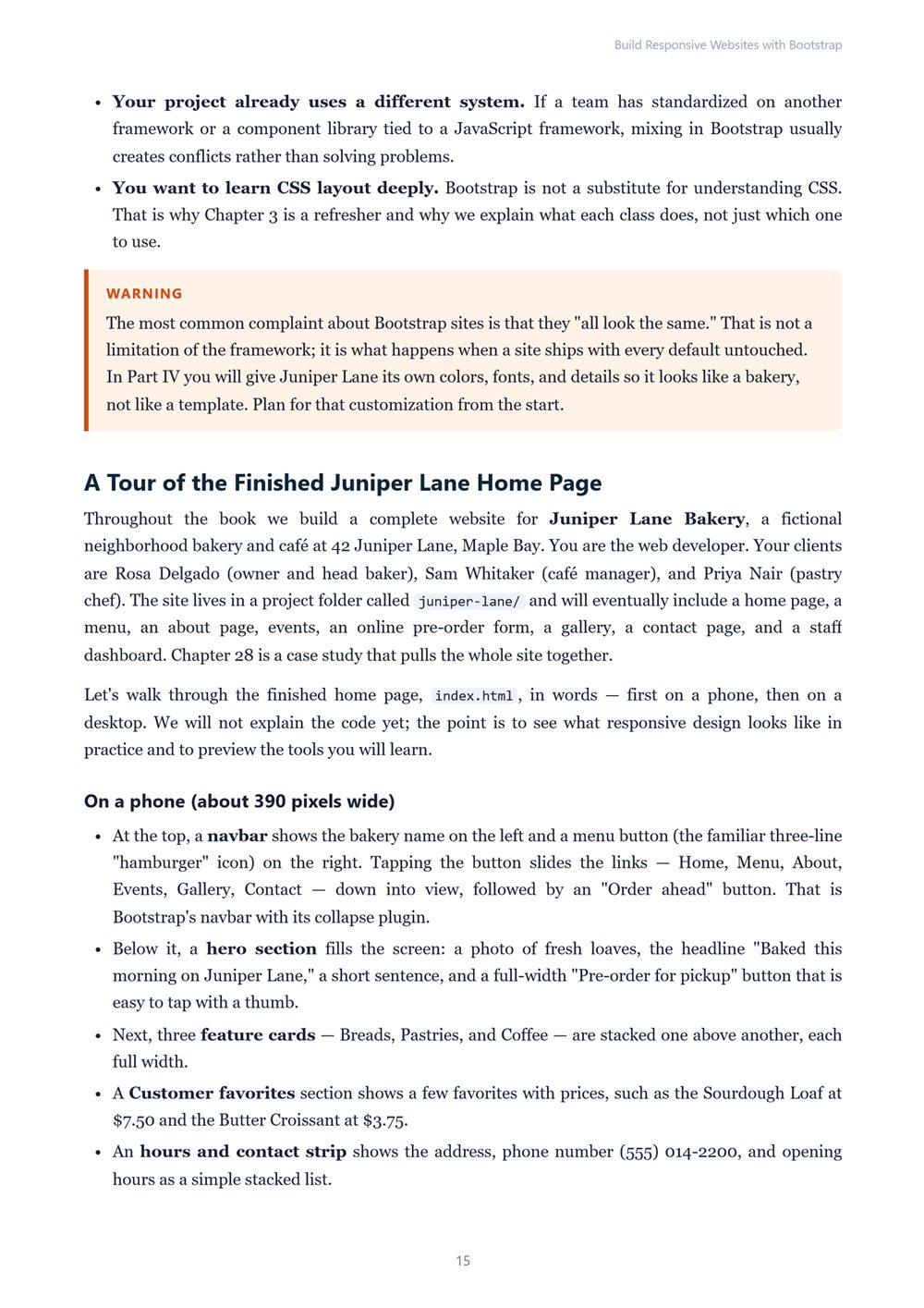
- Ch 28 · Case Study: Building the Juniper Lane Bakery Website
Appendices
- App A · Bootstrap Cheat Sheet
- App B · Starter Templates and Component Snippets
- App C · Responsive Launch Checklist
- App D · Glossary
WHO IT IS FOR
Beginners who know a little HTML and CSS, junior front-end developers who want to understand Bootstrap properly, designers and back-end developers who need clean responsive front ends, and students and freelancers building real sites.
FORMAT
PDF (A4), 495 pages, English, clickable table of contents and PDF bookmarks. 1st Edition, 2026. Published by thenexbooks.
This book is independent and is not affiliated with or endorsed by the Bootstrap team. Examples target Bootstrap 5.3.
Book details
| Detail | |
|---|---|
| Pages | 495 |
| Format | PDF (A4) |
| Language | English |
| Level | Beginner to Intermediate |
| Edition | 1st Edition, 2026 |
| Download on this site | Free sample, first 20 pages (PDF) |
| Publisher | thenexbooks |
ไฟล์ที่คุณจะได้รับ
ยังไม่มีรีวิว เฉพาะผู้ซื้อเท่านั้นที่รีวิวได้
สินค้าอื่นจาก thenexbooks